What Your Wall Color Says About You (And How to Get It Right)
Walk into someone's home and within seconds, you get a feeling. Maybe it's warm and grounding, or maybe it's crisp and energizing. A huge part of that impression comes from the walls — and not just the art hanging on them. The actual color of the paint does a lot of the heavy lifting.
Color psychology has been studied for decades, and while it's not an exact science, the patterns are hard to ignore. The shades you surround yourself with can genuinely influence your mood, your focus, and even how other people perceive you when they walk through your door. So if you've been staring at a blank paint chip trying to make a decision, maybe the better question to ask isn't what looks good — it's what feels like me.
The Basics: How Color Affects the Way We Feel
Before we get into personality types, let's talk about what's actually happening when you stare at a deep navy wall versus a pale sage one. Color triggers psychological and physiological responses — some of them pretty subtle, others surprisingly strong.
Warm colors like reds, oranges, and yellows tend to stimulate energy and conversation. They raise the pulse just slightly and create a sense of intimacy. Cool tones — blues, greens, and purples — do the opposite. They slow things down, encourage calm, and can even make a room feel slightly larger and more open.
Neutral shades — whites, grays, taupes, and beiges — are often described as "safe," but that word undersells them. A well-chosen warm white can feel like a deep exhale, while a cool gray can sharpen focus and reduce visual clutter. The key is that no color is neutral in its effect — it just depends on which version you choose and how you pair it.
Are You a Bold Color Person or a Quiet Palette Person?
Here's where personality comes in. Interior designers across the US have started talking less about "trending colors" and more about "authentic palettes" — the idea that your home should reflect your actual temperament, not just what's popular on Pinterest this season.
If you're someone who thrives on energy, social connection, and being the center of a good conversation, rich, saturated colors might be your natural fit. Think deep emerald greens in a living room, burnt sienna in a dining space, or a moody plum in a reading nook. These are the colors that say something's happening here — come in and stay a while.
On the flip side, if you recharge through quiet, value order, and feel most like yourself in calm environments, muted and earthy tones are likely going to serve you better. Dusty sage, warm linen, soft clay — these palettes feel grounded without being boring. A lot of people in the Pacific Northwest and New England have been leaning hard into this kind of palette lately, and for good reason. It matches a lifestyle that prioritizes stillness.
Room by Room: Matching Color to How You Actually Live
Personality is just one piece of the puzzle. How you use each room matters just as much.
The bedroom is where color psychology gets really personal. Sleep researchers consistently point to cooler, softer tones as conducive to rest — pale blues, soft lavenders, and warm whites top the list. But if you're someone who reads, journals, or does creative work in bed, a deeper, more enveloping tone like dusty mauve or warm terracotta might actually make the space feel more intentional and less like a waiting room for sleep.
The home office is where a lot of Americans have started experimenting since the remote work boom. Light greens and soft teals have surged in popularity for work-from-home spaces because they balance focus with calm — they're stimulating enough to keep you alert but not so electric that they fray your nerves after a few hours on Zoom.
The kitchen and dining room are great places to try something bolder. These rooms are built for activity and connection, so they can handle more visual energy. A warm mustard yellow or a rich rust can make a kitchen feel genuinely joyful. Terracotta, in particular, has had a serious moment in American homes over the past few years — it photographs beautifully, it pairs well with wood and brass accents, and it somehow feels both vintage and fresh at the same time.
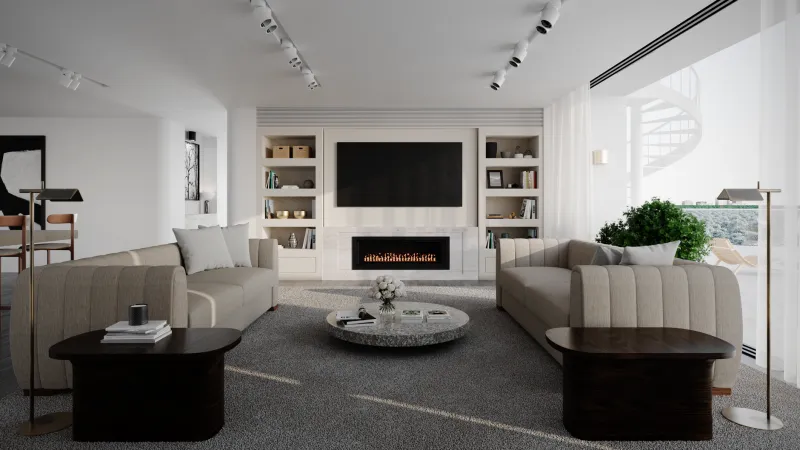
Living rooms are the hardest to get right because they have to do so many things at once. A good approach? Pick your dominant color based on the primary way you use the space. If it's mainly for unwinding, go softer. If it's your entertaining hub, go bolder. If it's both, a deep, complex neutral like warm greige or dusty blue-gray can carry the weight of both moods without committing too hard to either.
The Unexpected Color Choices People Are Actually Making
Some of the most charming walls out there right now belong to people who ignored the conventional wisdom entirely. Across the country, homeowners are painting ceilings dramatic colors while keeping walls white — a trick that adds personality without overwhelming a small space. Others are going full commitment on a single accent wall in a shade they were told was "too much," only to find it transformed the entire room.
Black walls, once considered a design risk, have become a quiet staple in creative households. A flat black or deep charcoal in a home library or studio space creates a cocoon effect — everything inside the room feels more intentional, more curated. It's a bold choice, but for people who identify as focused, introspective, or artistically driven, it often feels exactly right.
Then there's the growing trend of color drenching — painting walls, trim, and ceiling all the same shade. It sounds like a lot, but in practice, it creates a surprisingly cohesive, almost meditative effect. It's especially striking in small rooms where the continuity of color makes the space feel considered rather than cramped.
How to Test Before You Commit
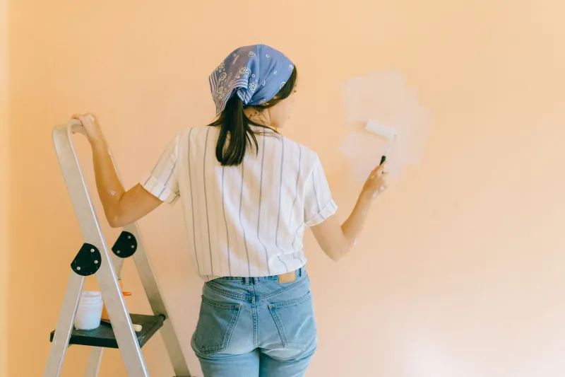
Here's the most practical advice in the whole article: never pick a paint color from a chip alone. Get a sample, paint a large swatch (at least 12x12 inches), and live with it for a few days. Look at it in morning light, afternoon light, and lamplight in the evening. Colors shift dramatically depending on natural light and the undertones in your existing furniture and flooring.
Also, trust your gut more than you trust trends. If a color makes you feel something when you look at it — curious, calm, energized, nostalgic — that reaction is data. Your walls spend every day with you. They should feel like yours.
The best spaces don't just look good in photos. They feel like home the moment you walk in. And more often than not, that feeling starts with color.